
Whole Foods Market
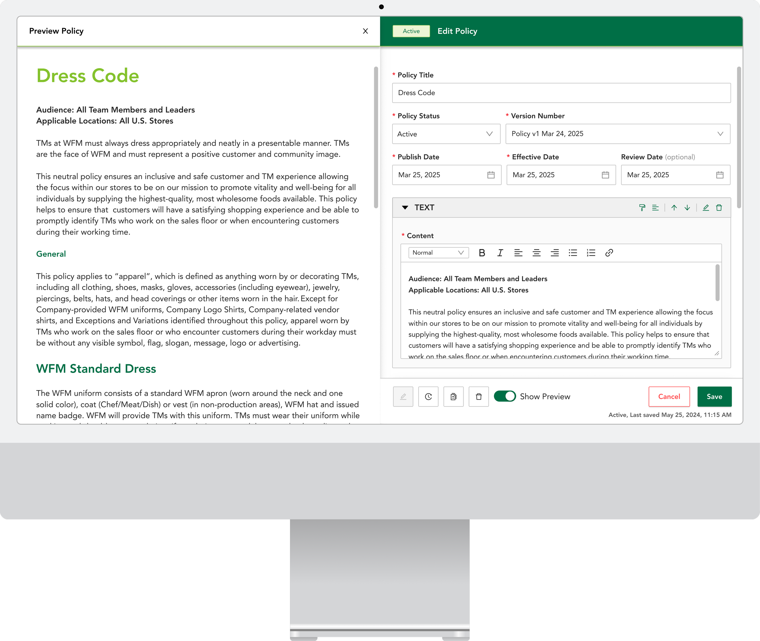
Modernizing legal document management.
Whole Foods Market managed its company-wide employee policy, internally known as the General Information Guide (GIG), through mostly paper-based workflows with no digital source of truth. More than 20,000 Team Members searched corporate policy every week, and it lived as a flat list of links with no way to sort, search or confirm that the current version was seen.
Without a way to efficiently create legal documents and accurately track Team Member attestations, the existing workflows exposed the company to significant legal risk.
The goal was to make employee policies easily accessible for busy Team Members while enabling the legal team to track policy acknowledgements in one place. I designed Smart GIG, a consolidated legal document authoring and viewing platform that reduced an estimated $1 million in annual legal risk.
- Timeline
- March 2024 to September 2024
- Role
- Requirements gathering, conceptualization and visual design
- Tools
- Figma
- Innerview
- Worked with
- Project Manager
- Lead Software Architect
- Associate Software Architect
From whiteboard to build-ready
Workshops with the Whole Foods legal team and a sample of Team Members mapped the future state on a wall. Weekly reviews turned it into a specification a developer could build.
01Discover4 sections
A workshop with the people writing the policy.
To gain a contextual understanding of the existing workflows and the suite of enterprise tools used in legal document authoring and publishing, I conducted an insight-gathering workshop with the Whole Foods Policy and Compliance Team.
The session established how corporate policy was written, approved and distributed across the company.
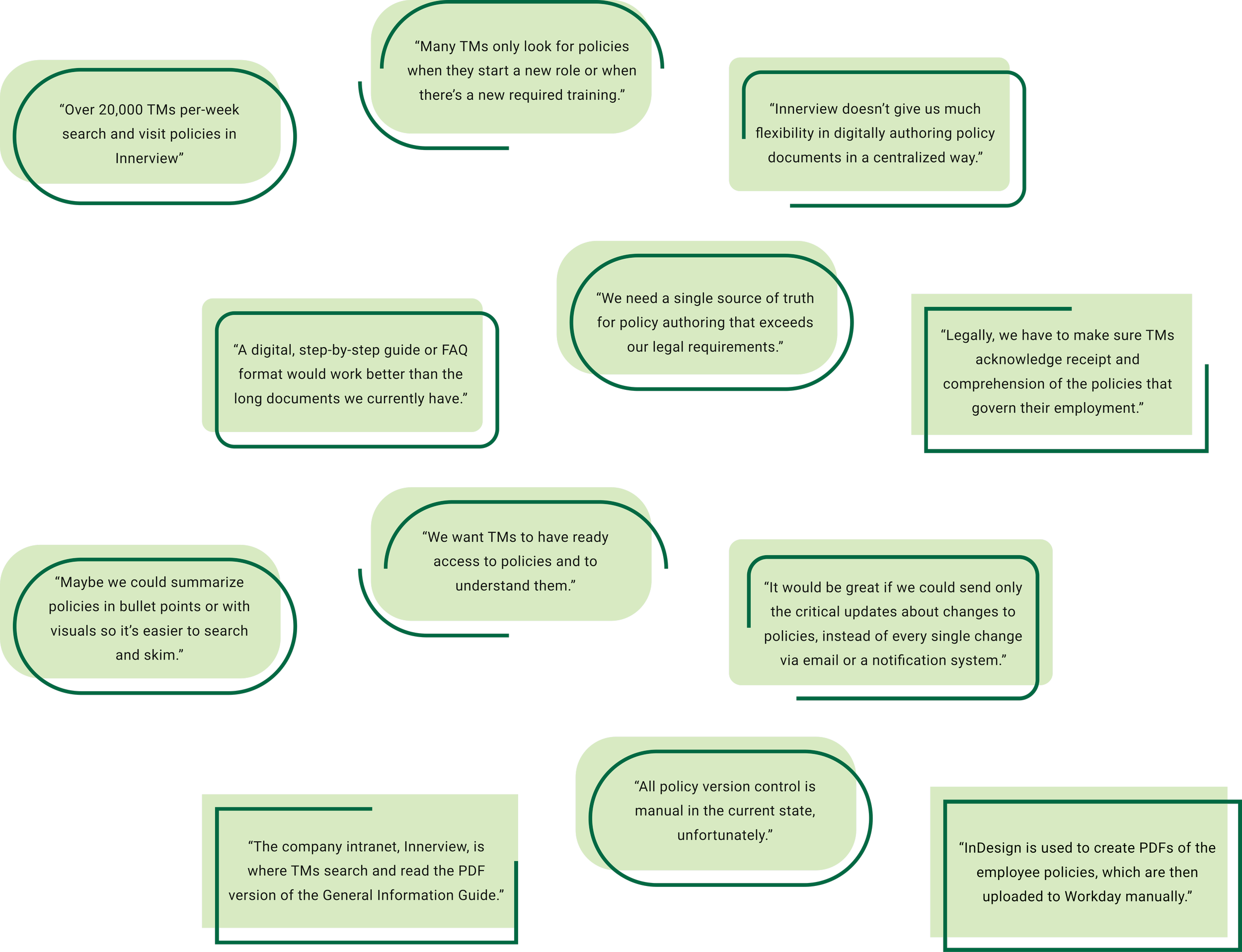
20 interviews with the people reading the policy.
More than 20,000 Whole Foods Team Members search and visit corporate policies every week. I conducted one-on-one user interviews with a sample of 20 Team Members to gain insight into how they access, view and acknowledge policy documentation.
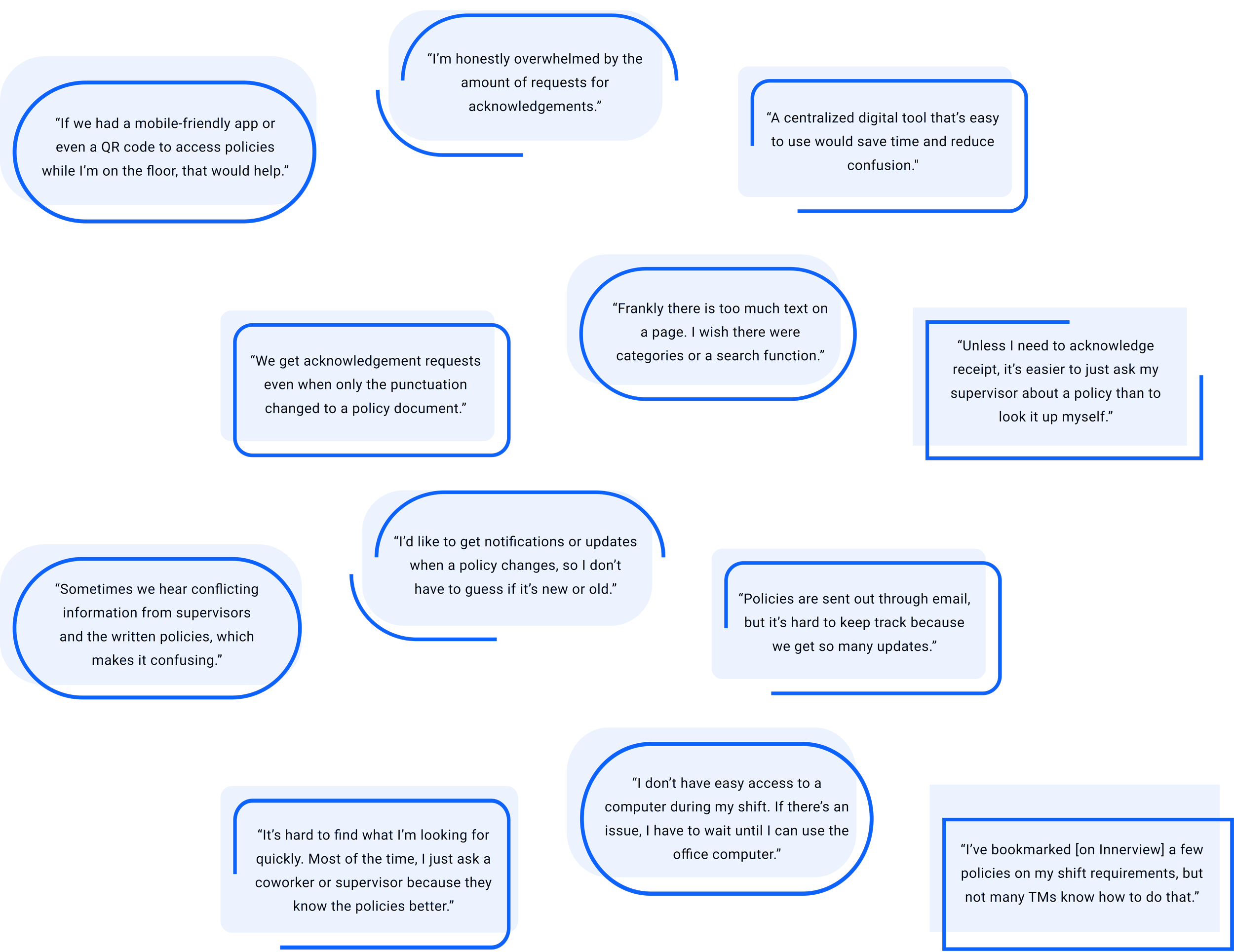
A PDF behind a long list of links.
The Whole Foods General Information Guide (GIG) is the company-wide employee policy document. For the authoring team, the GIG is referred to as a policy set, which is broken down into a granular set of individual policies.
The PDF version of the GIG was accessible from the Whole Foods intranet, Innerview. Individual policies were represented by a lengthy list of selectable links, with no ability to search or sort.
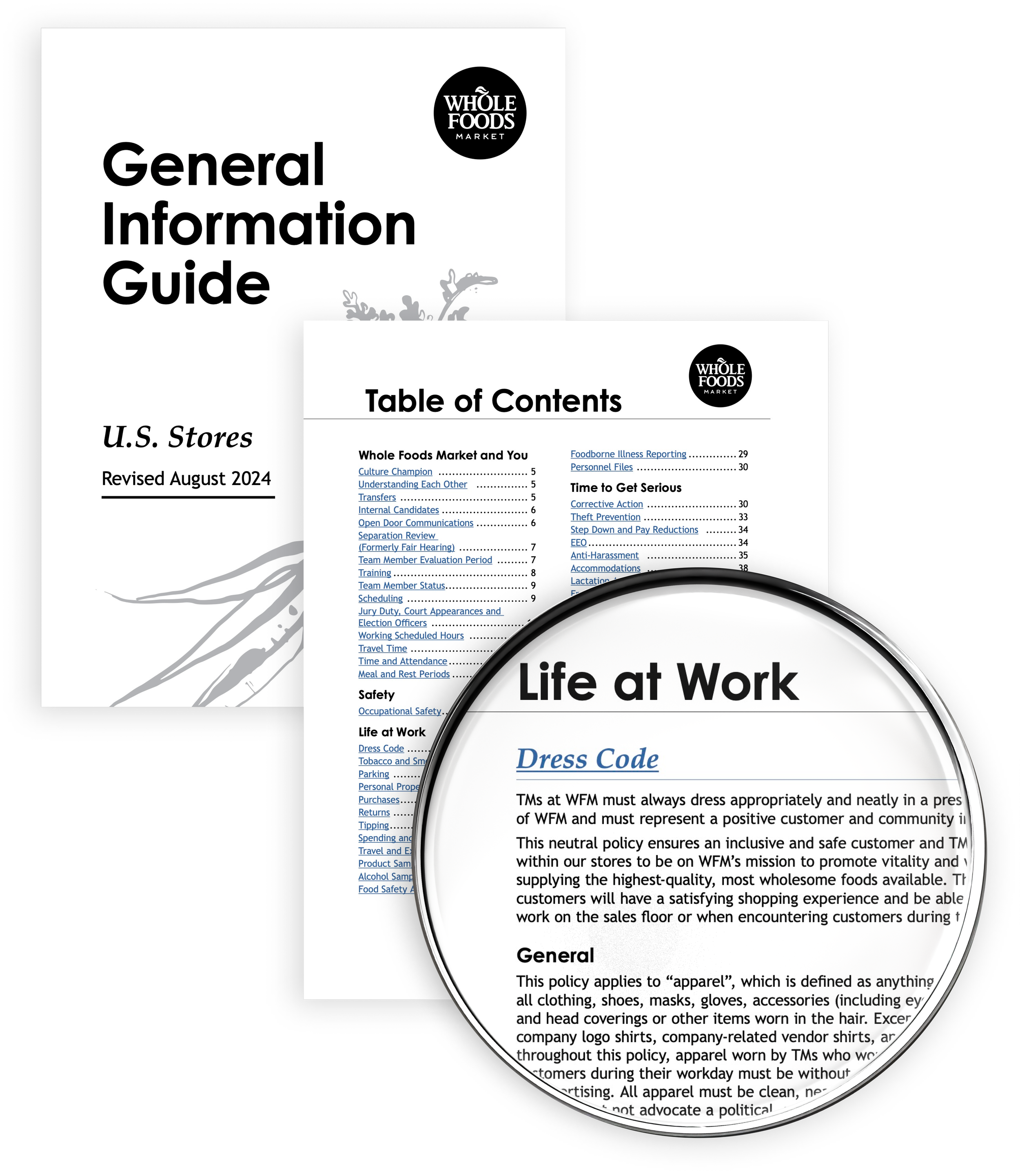


The current state of authoring and viewing.
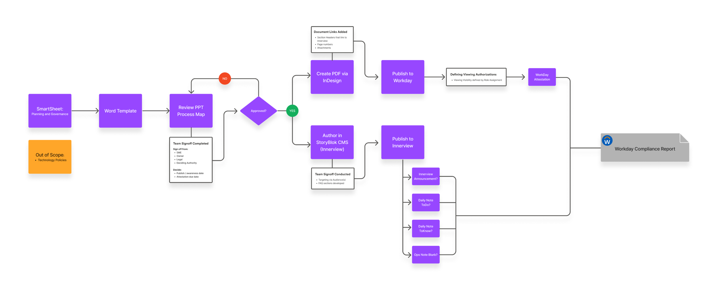
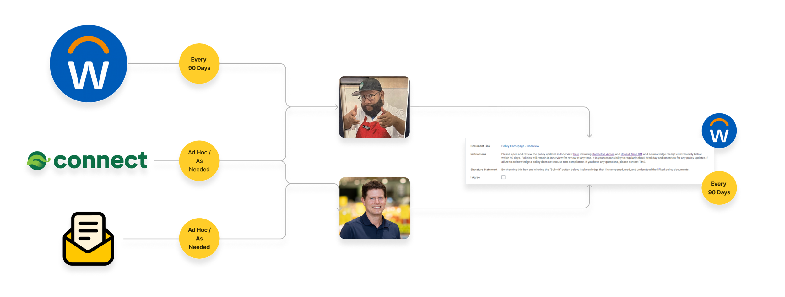
To map the current policy authoring and publishing workflows, I collaborated with developers, project managers and end users to visualize the existing systems and identify inefficiencies.
User insights from the mapping sessions highlighted how critical the authoring and viewing workflows were within each role.
02Define4 sections
Eight themes, split between authoring and viewing.
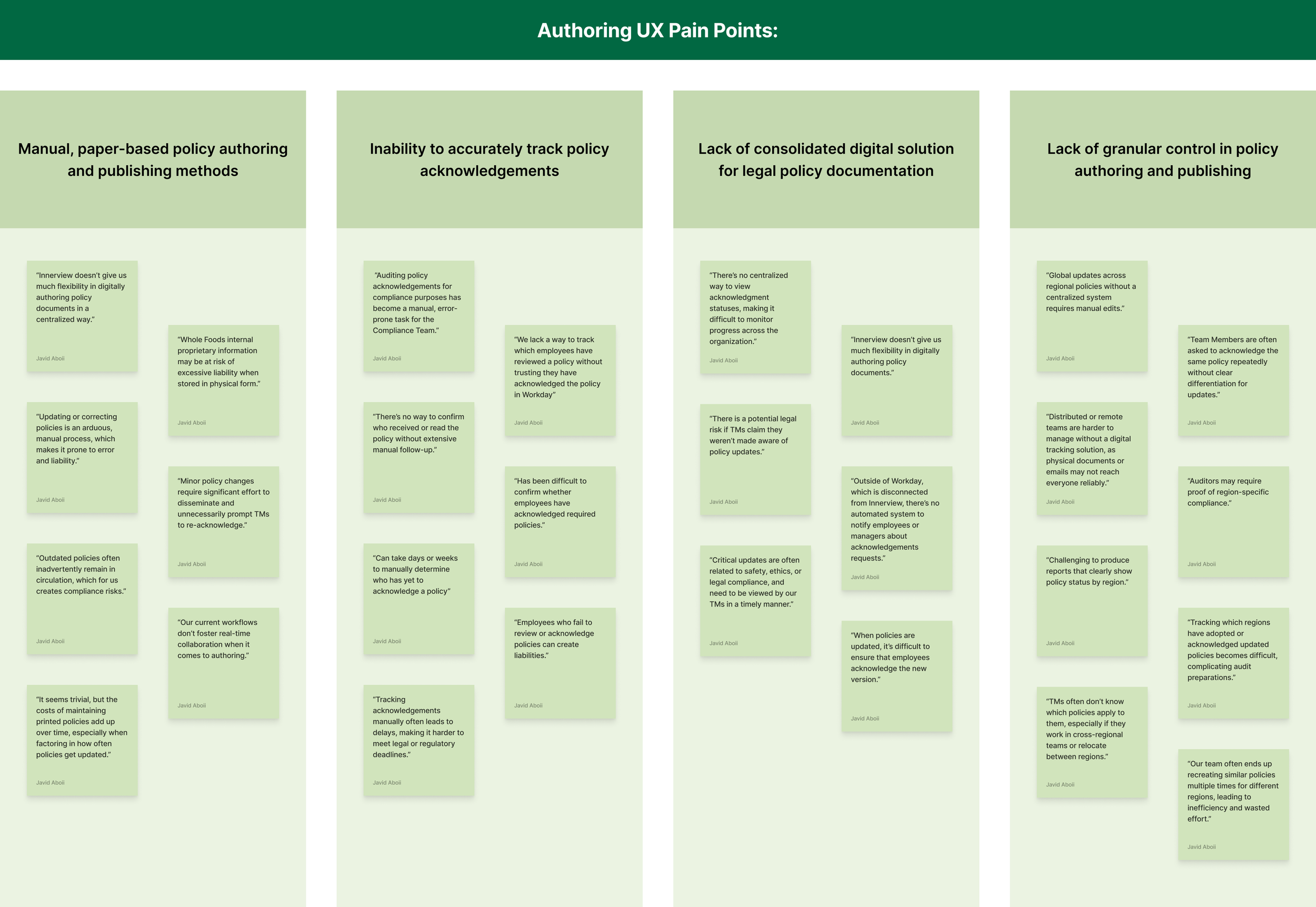
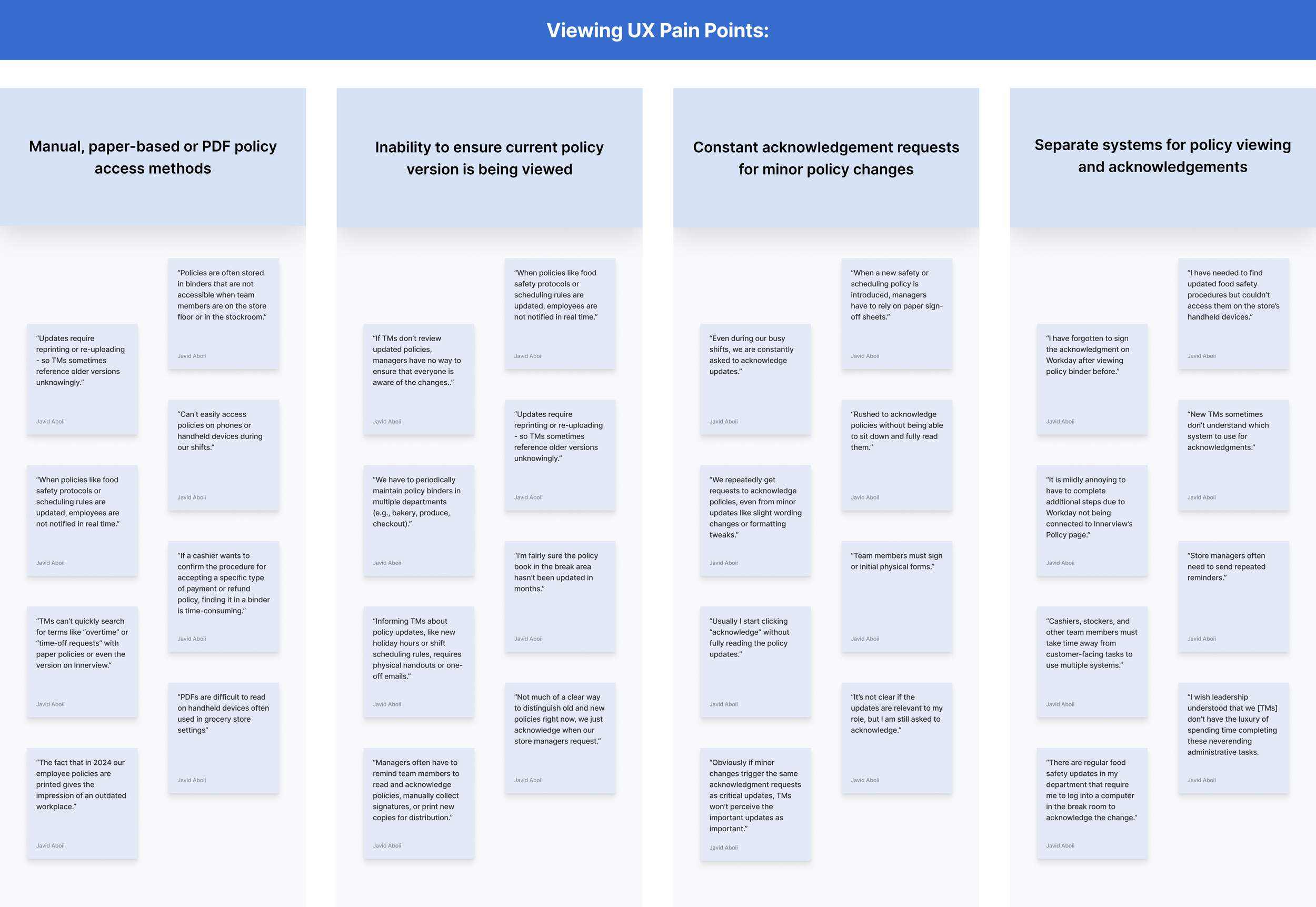
User pain points were grouped thematically by contextual similarity and separated between the policy authoring and policy viewing experiences. Each experience distilled into four themes.
Authoring pain points
- Manual, paper-based policy authoring methods
- Inability to accurately track Team Member policy acknowledgements
- No single digital solution to facilitate the authoring, acknowledgement tracking and viewing of legal policy documentation
- Lack of granular control in policy publishing, such as regional policy versioning
Viewing pain points
- Manual, paper-based or PDF policy access methods
- Inability to ensure the current policy version is viewed
- Constant acknowledgement requests for even minor policy changes
- Separate systems for policy viewing and acknowledgement
Built for the people writing the policy.
An analysis of the authoring pain points emphasized four features centered on policy document authoring, management and acknowledgement tracking.
- 01
Centralized digital policy management
Policy authors want a consolidated, digital solution to streamline policy authoring, tracking and distribution, allowing real-time collaboration and updating across all touchpoints.
- 02
Acknowledgement tracking system
Policy authors want automated acknowledgement tracking, notifications and compliance escalation to accurately request and log Team Member policy acknowledgements.
- 03
Regional policy publishing
Policy authors want the ability to specify region-specific policy elements without creating an entirely separate General Information Guide.
- 04
Document version control
Policy authors want robust version control to clearly manage edits, track changes and publish updates.
Built for every Team Member use case.
An analysis of the viewing pain points emphasized three features centered on policy access, viewing and acknowledgement submissions.
- 01
Centralized and current policy access
Team Members want a centralized, digital repository of policies to easily search and view the latest policy versions.
- 02
Smart acknowledgement system
Team Members want to review and acknowledge the specific changes made to a policy without re-acknowledging the entire policy document.
- 03
Enhanced experience across devices
Team Members want a user-friendly policy viewing interface optimized for both desktop and mobile devices.
The future state, settled before any screen was designed.
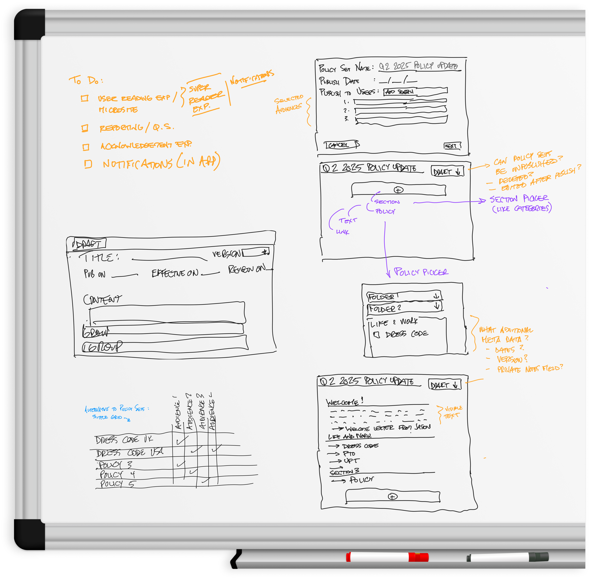
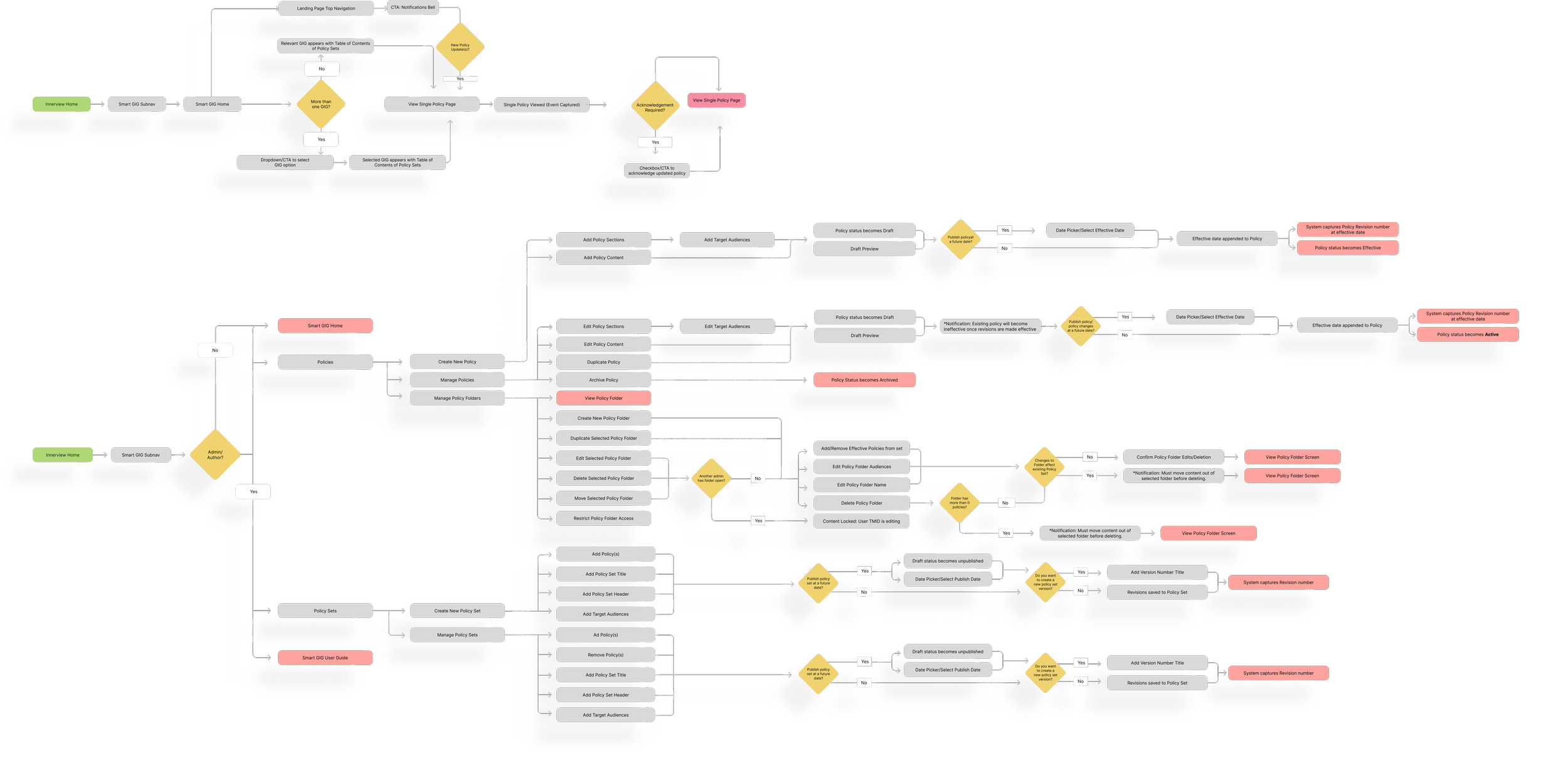
I facilitated in-person whiteboarding workshops with the Whole Foods legal team and a sample of Team Members to develop proposed future-state user flows for both the authoring and the viewing experiences.
Policy sets, categories and the relationships between them were defined on the wall, which fixed the structure of the platform ahead of any screen. The output of each session was a wall of open questions grouped by theme.

Scroll sideways to follow the flow

Scroll sideways to follow the flow
03Develop4 sections
One fidelity step at a time.
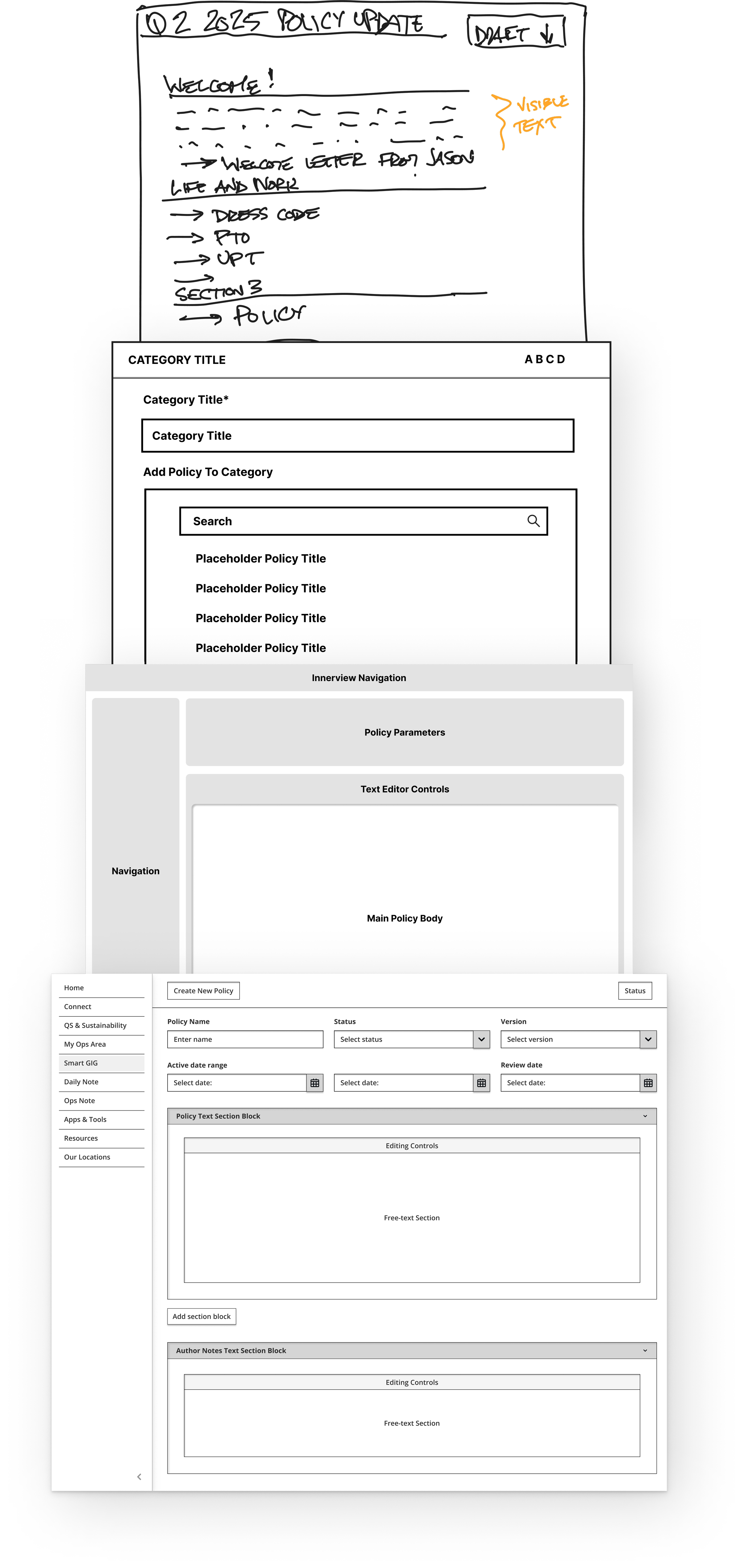
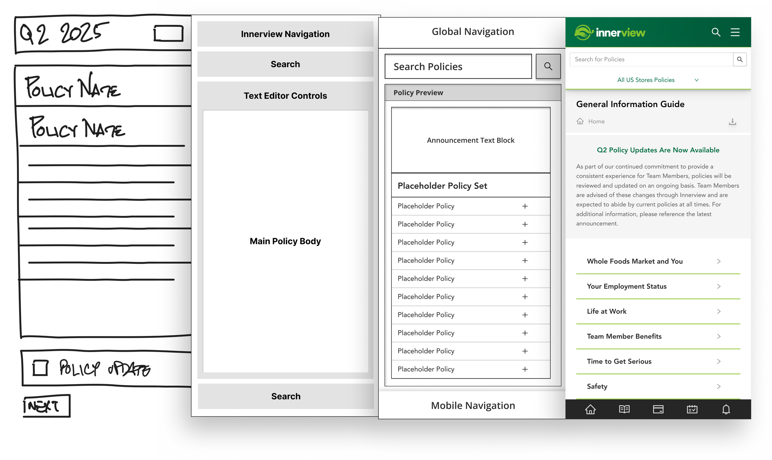
I explored solutions through rapid prototyping. The work climbed one fidelity step at a time: marker sketches, rough wireframes, a clickable prototype and a build-ready specification. Each pass answered a narrower question than the one before it.

- Pass 01 · Rapid sketching
Marker on a board
Minutes per idea, drawn live in the room with the legal team. The sketches settled what a policy set contains and which sections exist.
- Pass 02 · Low fidelity
Boxes and labels
The first pass in a design tool. Grey boxes and placeholder titles answered how an author finds a policy and attaches it to a category, before type or colour were introduced.
- Pass 03 · Interactive prototype
Structure you could click through
Navigation, policy parameters and the editor were placed relative to each other and wired together, so reviewers moved through the flow in the weekly sessions. The layout was settled here.
- Pass 04 · High fidelity
A build-ready specification
Every field, state and control was drawn at production fidelity: statuses, version pickers, active and review date ranges and repeatable section blocks.
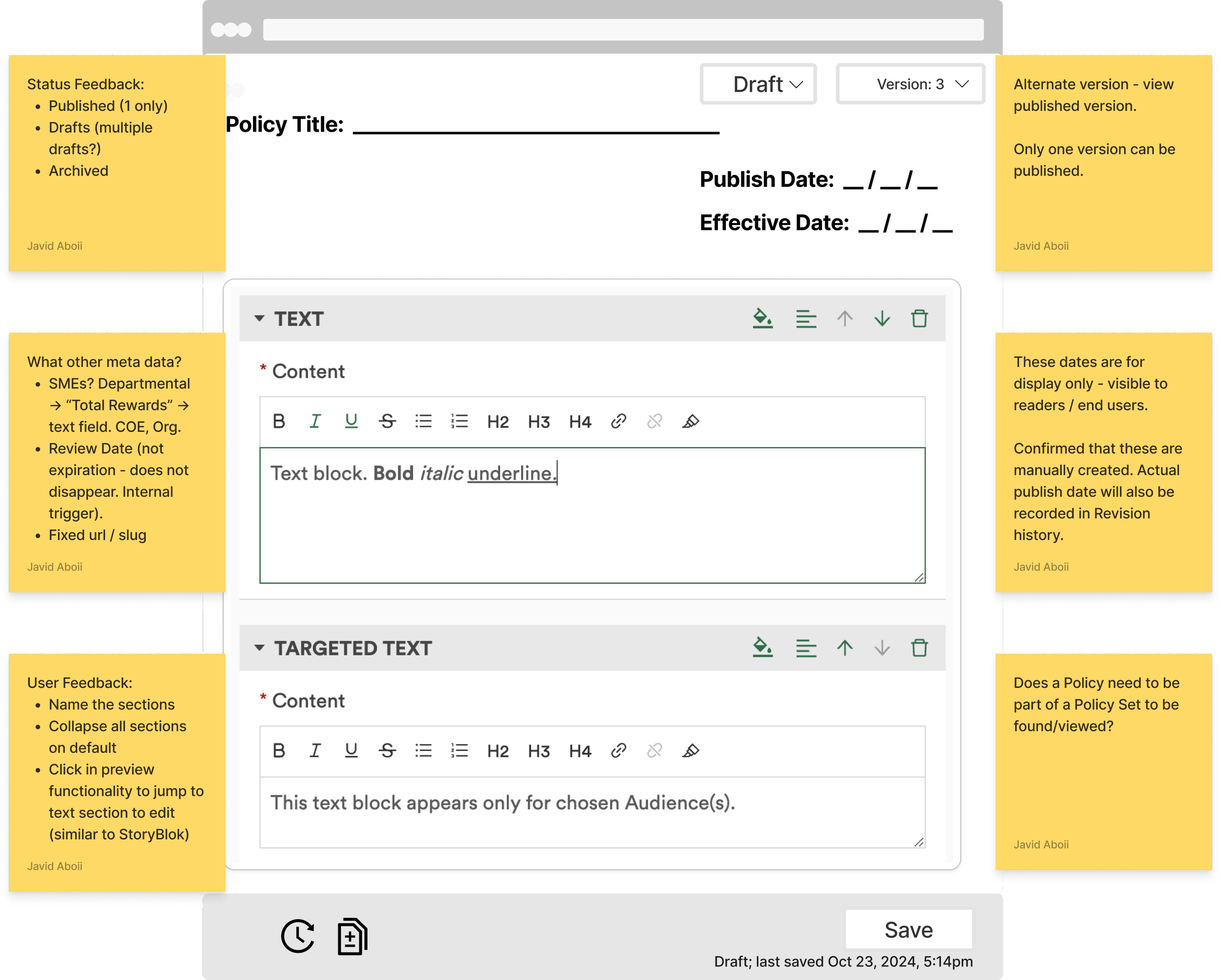
The screens changed after every session.
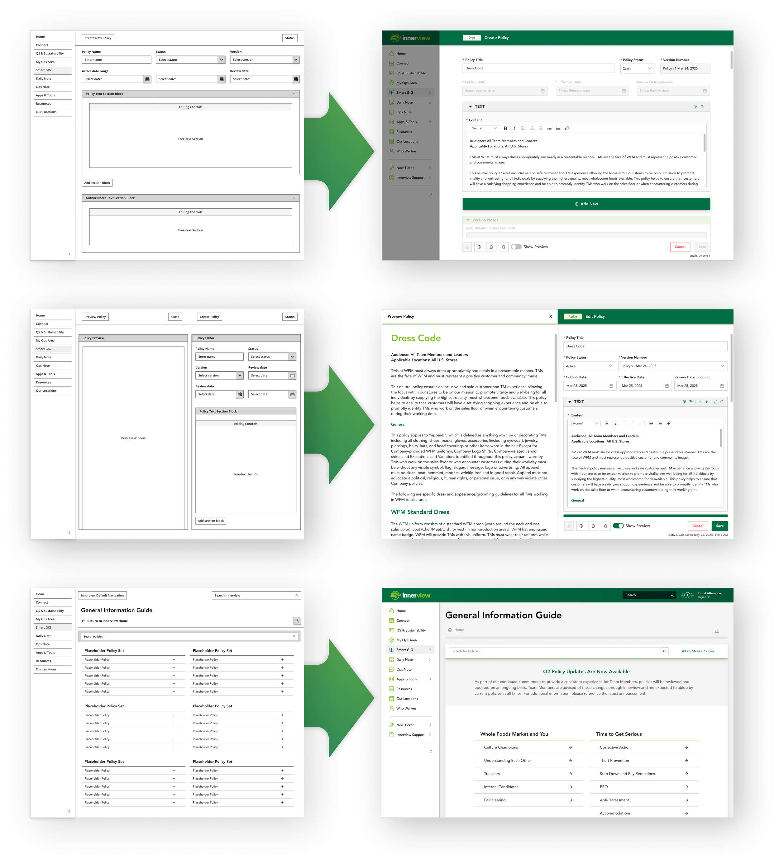
Early sketches and low fidelity wireframes defined the structure of the future Smart GIG platform. I conducted weekly review sessions in person with end users, project managers and developers. Low fidelity wireframes were walked screen by screen, and the feedback from each session was drawn before the next one.
Early feedback from policy authors set the shape of four screens: the policy library, the manage policies table, the create policy form and the dual-pane editor. Running the reviews with developers in the room kept every decision inside what the platform could support.


High fidelity, built from existing components.
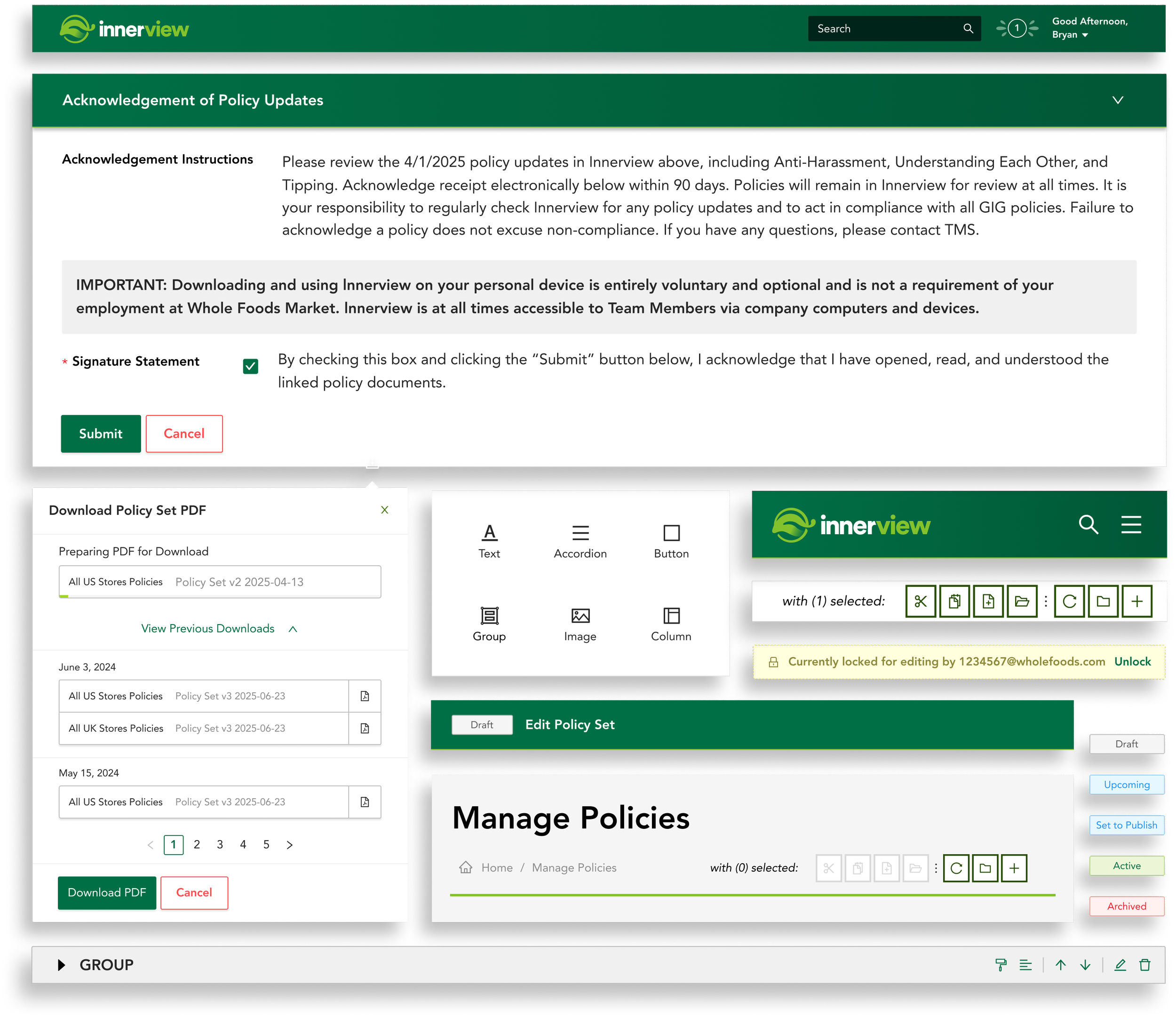
After validating the draft wireframes, I integrated components from the Whole Foods enterprise design system into high fidelity mobile and desktop mockups.
Design system components streamlined the design and build process and kept the mobile and desktop mockups consistent with brand standards.

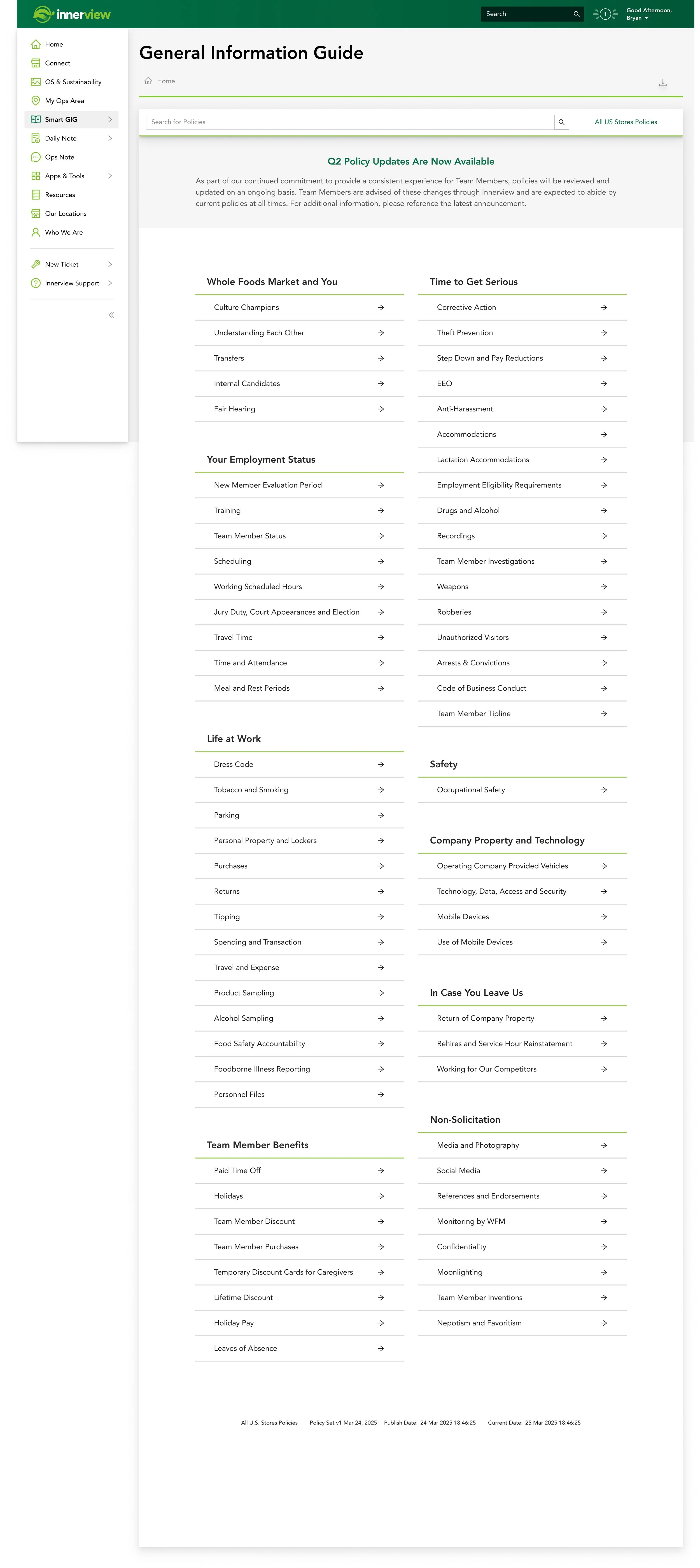
Team Members asked for policies at a glance.
Iterative user feedback guided the placement of UI elements in the viewing experience mockups. Insights from regular usability sessions informed the content hierarchy and the touchpoints.
I initially proposed an expander-based homepage, where a Team Member selects a policy set expander to view its nested policies. User feedback showed a preference for an at-a-glance policy viewing experience without expanding a policy set first, and the homepage was redesigned around it.
04Deliver5 sections
Tested against the job, then handed to build.
High fidelity prototypes were tested with Team Members and the legal team before development began. Visual design ran through to launch on the internal platform, shipping seven features across the authoring and viewing experiences.
The specification went to development as a walked flow, with every state and every transition between them drawn in place.

Scroll sideways to follow the flow
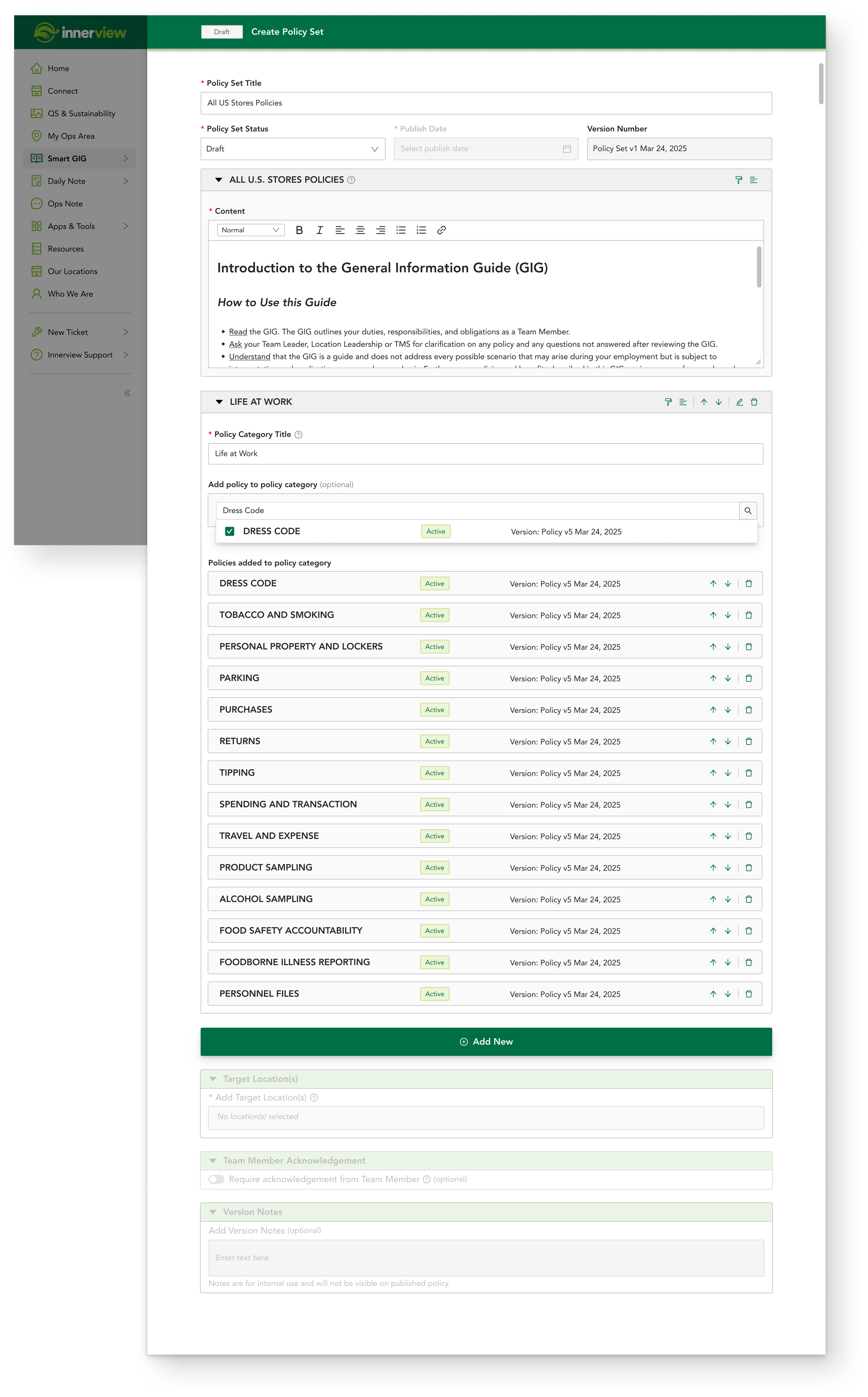
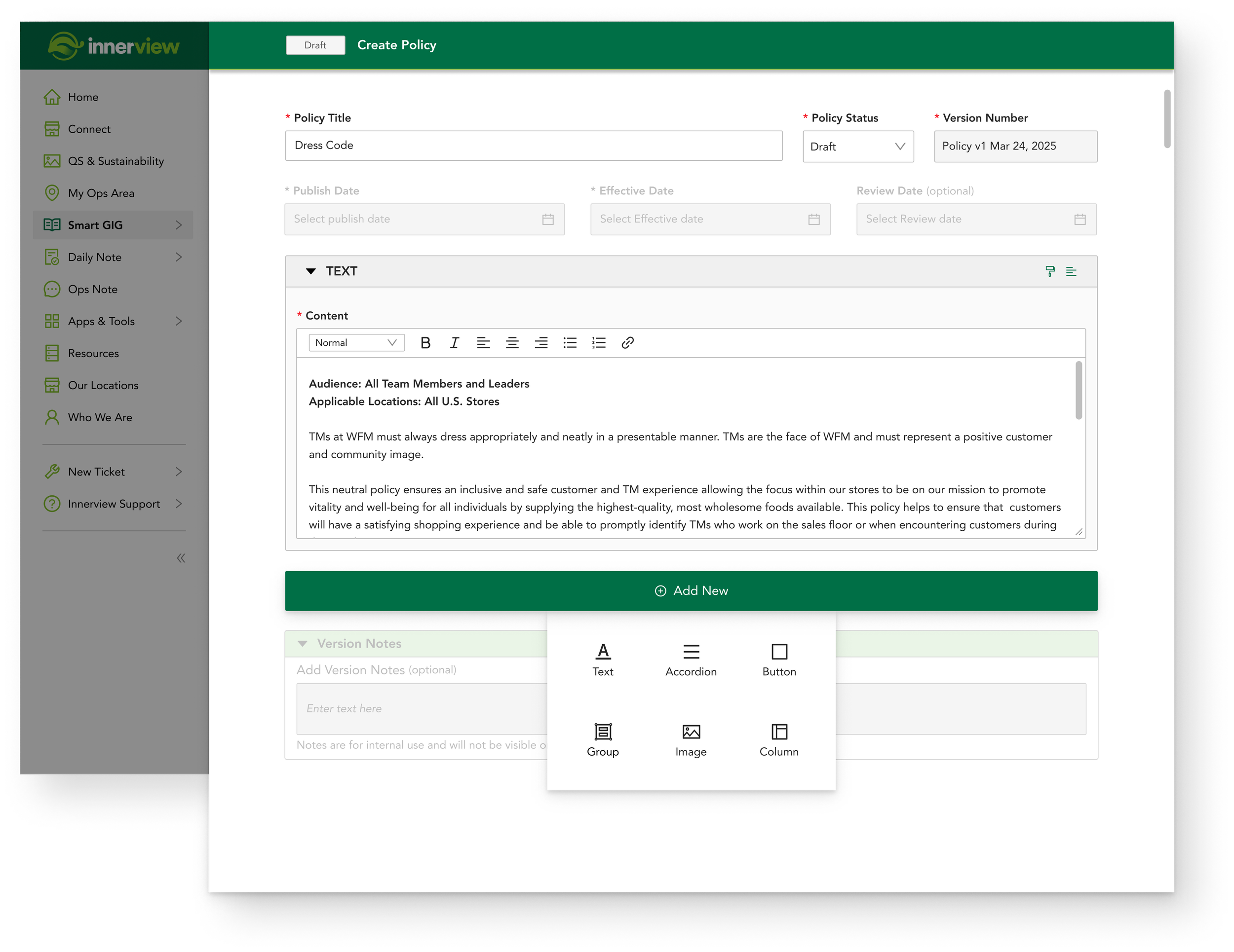
Individual policies, nested inside policy sets.
The policy and policy set editor consolidates policy management. Authors create individual policy documents and nest them within larger policy sets.
Authors manage content, target specific regions, control document versions and navigate between policies from the same editor.
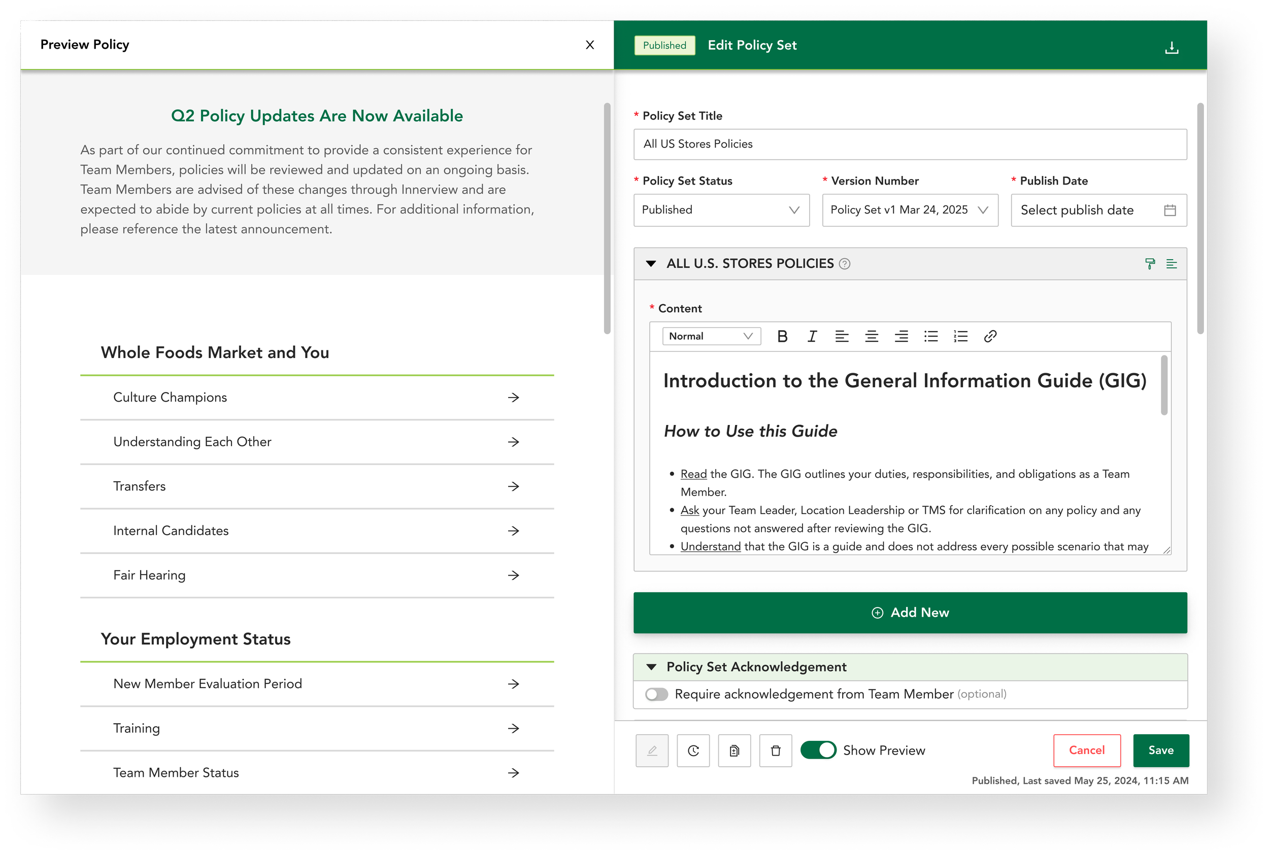
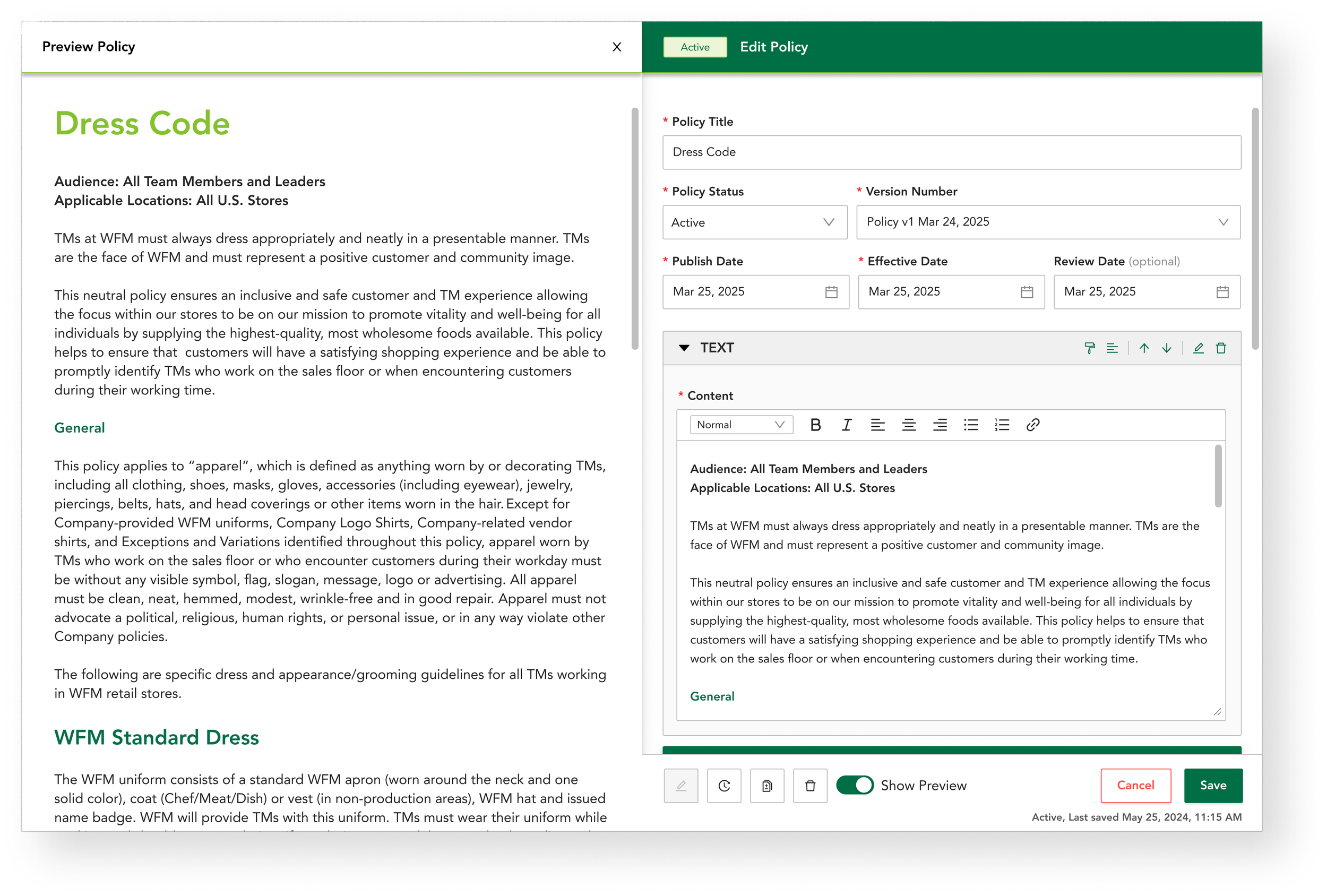
The published page, shown while it is written.
The live preview editor displays real-time policy updates alongside the editing interface. Authors visualize policy edits as they make them, which reduces editing errors.
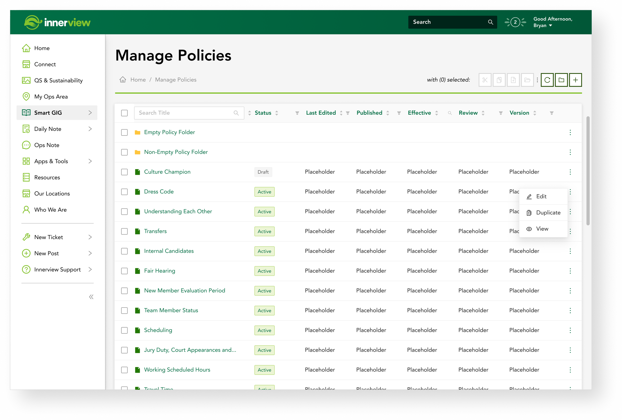
One repository, with version control.
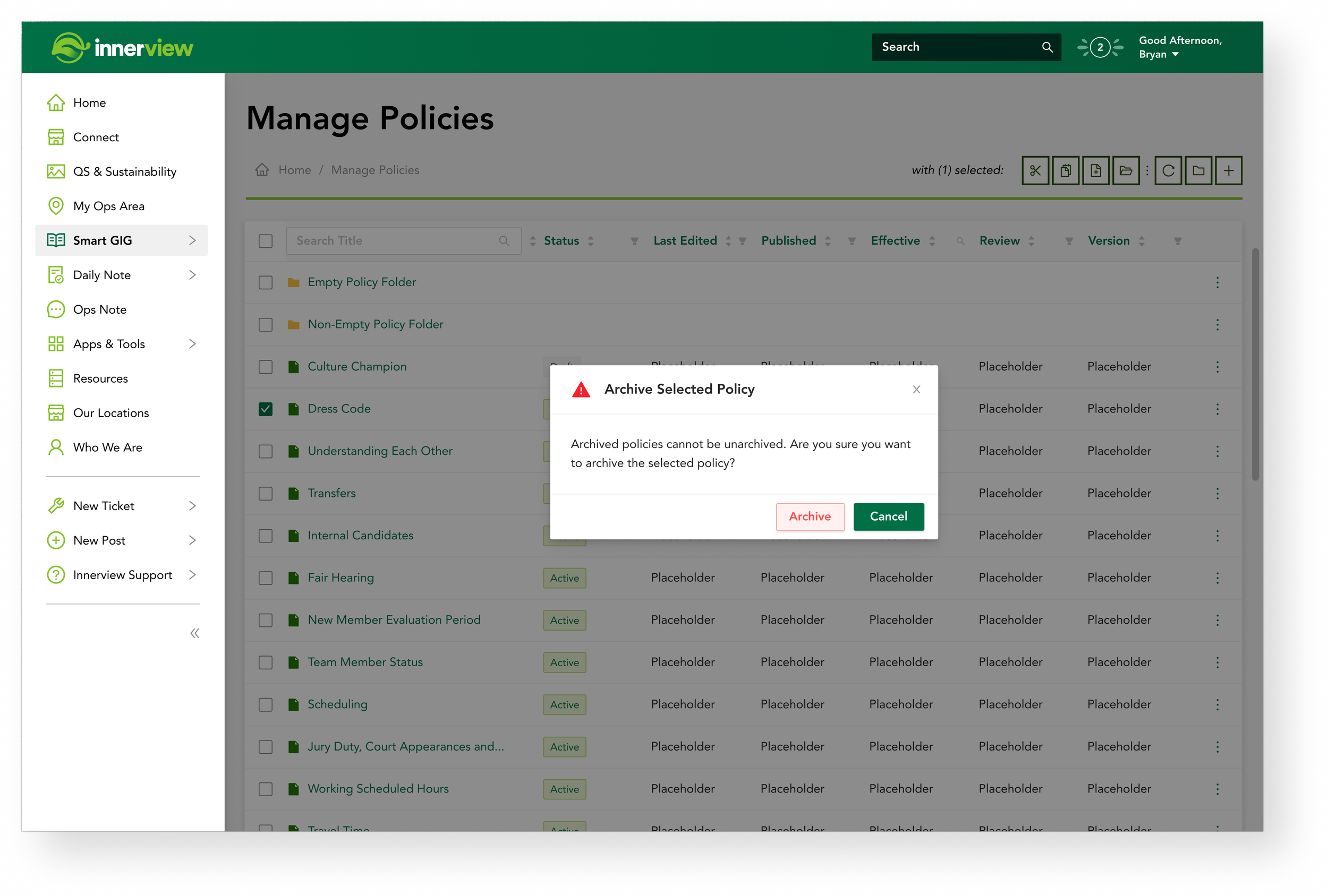
Policies are organized within a centralized repository. Authors manage, update and track individual policy versions and group them into structured folders.
Policy authors always edit the latest policy document and Team Members always access the latest approved version, which aids compliance and reduces legal risk across Whole Foods Market.
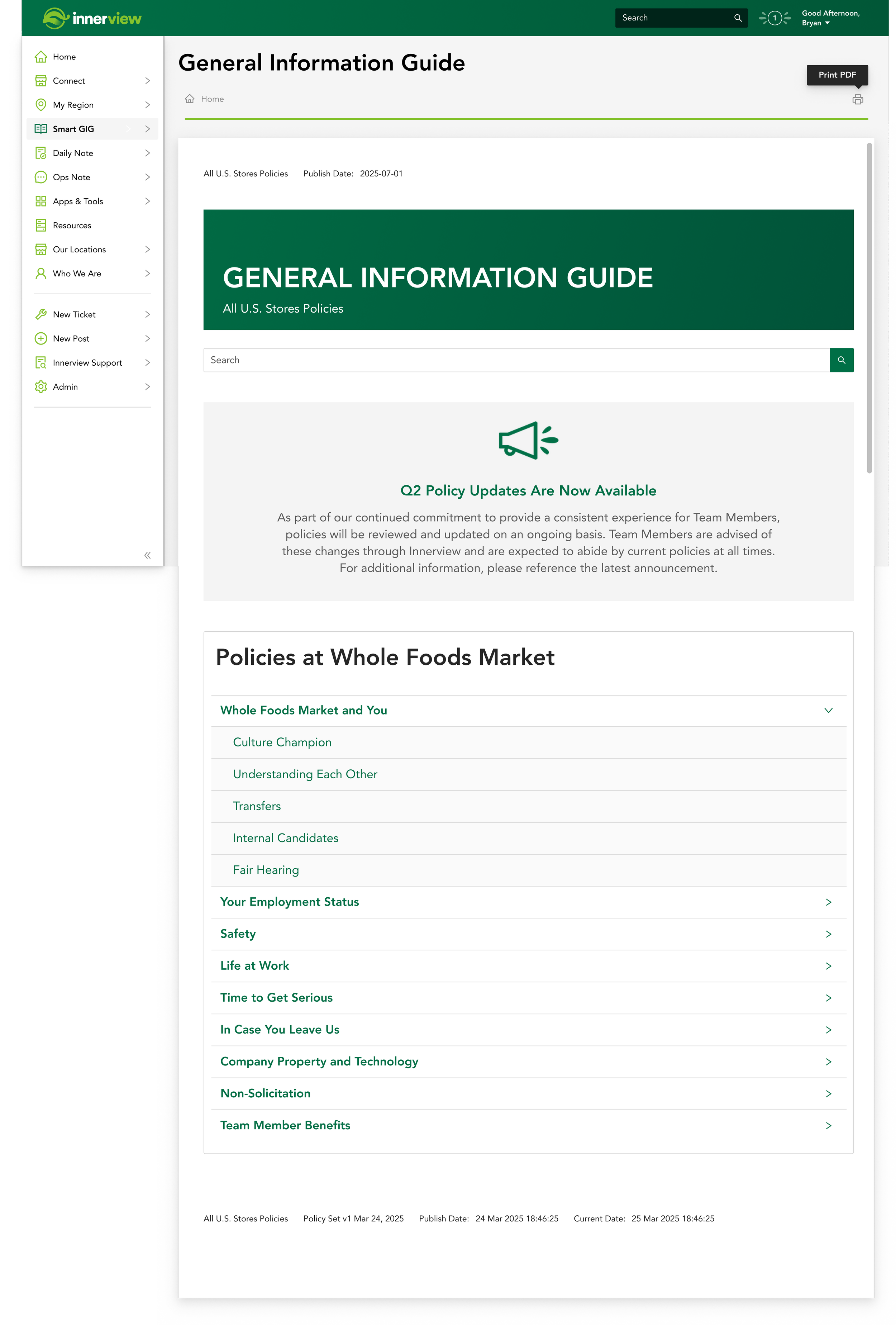
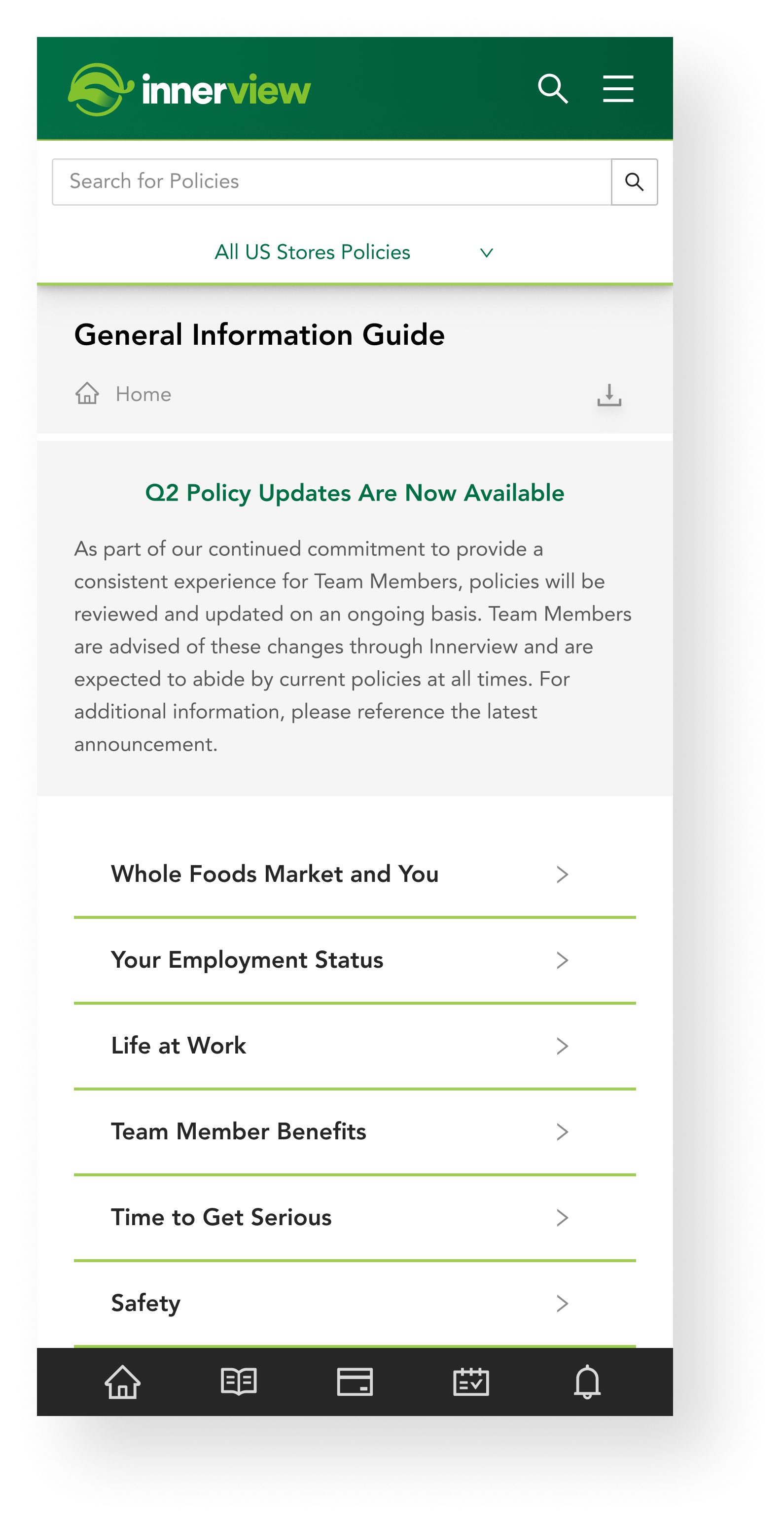
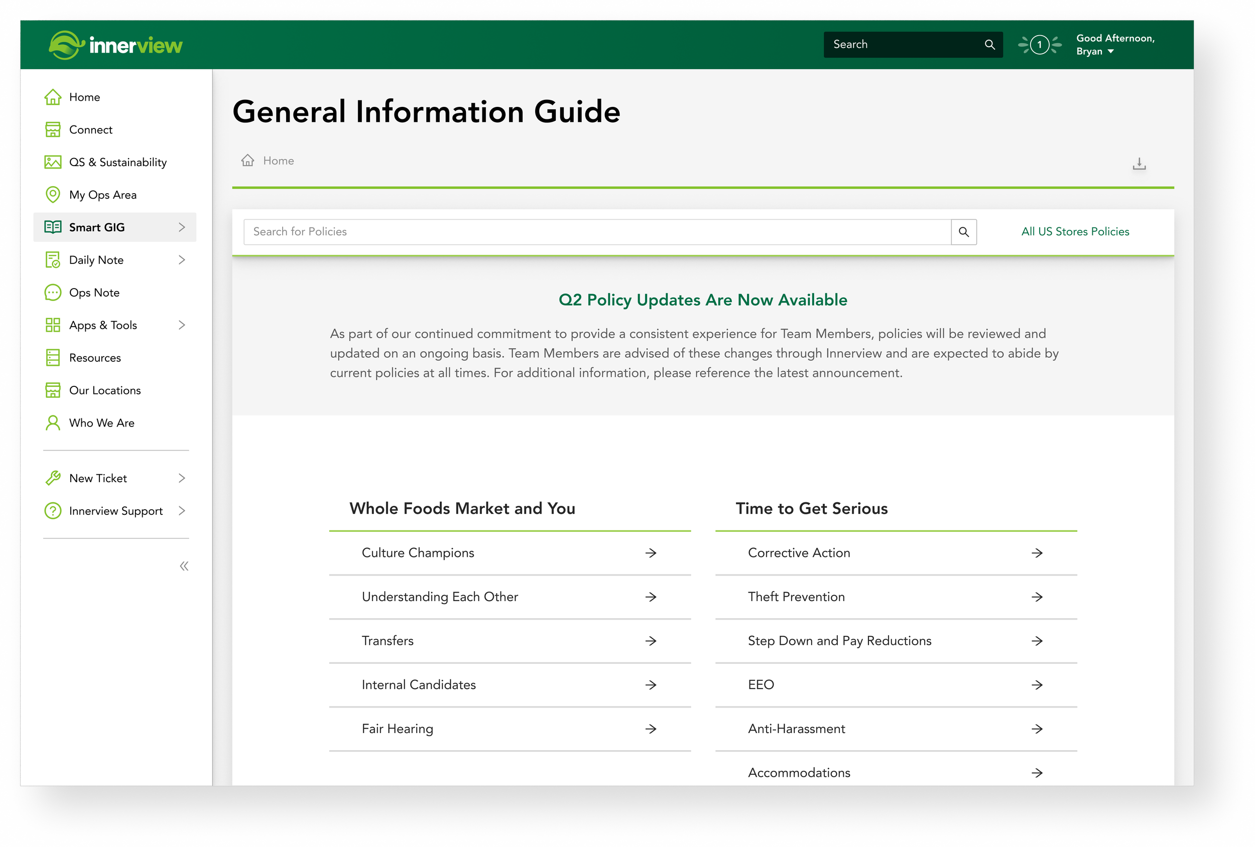
A searchable, role-specific table of contents.
The General Information Guide homepage is the interface for accessing essential policies and information.
The GIG was designed for scannability. It features a device-responsive, searchable, role-specific table of contents, so Team Members find the most relevant, up-to-date content.
A single source of truth
One platform to author individual policy documents and nest them within larger policy sets, with control over content, regional targeting, versioning and navigation. A centralized repository keeps every Team Member on the latest approved version.


-
~$1M
Estimated annual legal risk reduced by digitizing paper-based policy workflows.
-
20,000+
Team Members served, accessing current policy every week.
-
7
Features shipped across the authoring and viewing experiences.
-
1
Digital source of truth, replacing manual paper workflows.


Open to freelance and contract UX work.
Book a call