

A clearer view of your career at Slalom.
Slalom employees had to move between separate internal tools to understand their performance, find opportunities, manage role approvals and plan their next move. I led the design of me@slalom, a Salesforce-based employee platform that brought those parts of career growth into one place.
Career tools
that didn’t work together.


At Slalom, an employee’s career information was spread across separate sites for metrics, roles, staffing and learning. People entered information without knowing where it went, waited through slow approval processes and struggled to see what they needed to do next. They needed a connected view of their work, opportunities and career path.
How might we consolidate and redesign disconnected enterprise platforms to improve the overall employee experience and reduce attrition?
“I want to know the information I’m putting in is being fed somewhere. It’s a vacuum.”
“Some of these tools don’t talk. This is so archaic.”
“It is a laborious process to get a role approved.”
Verbatim, from 30 interviews across title and tenure.
My goal was to make every metric, opportunity and career path visible in real time, so employees could map their career growth within Slalom.
Starting with the work employees were trying to do.
I interviewed 30 employees and surveyed 50 more before designing any screens, then turned what I heard into six product areas, three user views and a future state structure built on Salesforce.
01Discover
Interviewing thirty people across title and tenure.
I interviewed 30 employees and surveyed 50 more before designing screens. Each interview started as a contextual inquiry, with people walking through the tools they already used, and then moved to the tasks they were trying to complete and where the experience broke down. I validated the interview themes against the survey results.
The number of questions you have to fill out is insane.
It feels like rewriting your resume, but for [Slalom].
It feels like an individual experience that we’re all doing because we have to.
02Define
Turning research into product decisions.
I grouped the interview notes and survey responses on a Miro board through affinity mapping, and the board settled into 20 themes. From those themes I identified six areas where the platform could make a meaningful difference.
- 30User interviews + 50Survey responses
- 20Themes
- 6Product areas
- 3User views
“The number of questions you have to fill out is insane.”
“I’m having to spend 40 hours filling out these questions.”
“It is a laborious process to get a role approved.”
“Gives directions on how to transition my career, which could be clearer, but useful nonetheless.”
“It feels like rewriting your resume, but for [Slalom].”
“Some of these tools don’t talk. This is so archaic.”
“It feels like an individual experience that we’re all doing because we have to.”
Scroll the board sideways to read it.
Those six areas became the foundation of me@slalom, and all of them centered on two needs: transparent performance management and clearly defined career growth.
Actionable metrics
Team members want utilization metrics displayed in real time alongside recommendations for improvement.
Talent networks
Team members want to search for other practitioners and network globally by capability as well as by name.
Learning opportunities
Team members want relevant learning and career growth content recommended to them instead of searching for it.
Workforce management
Team members want relevant client staffing opportunities recommended to them.
Team performance management
Team members want regional and global metrics displayed alongside their individual metrics.
Career growth pathways
Team members want clearly outlined steps toward a defined career outcome without having to change employers.
02Define
Designing for three views of the same system.
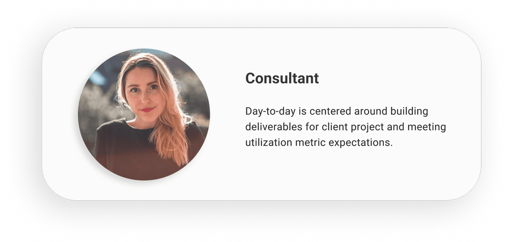
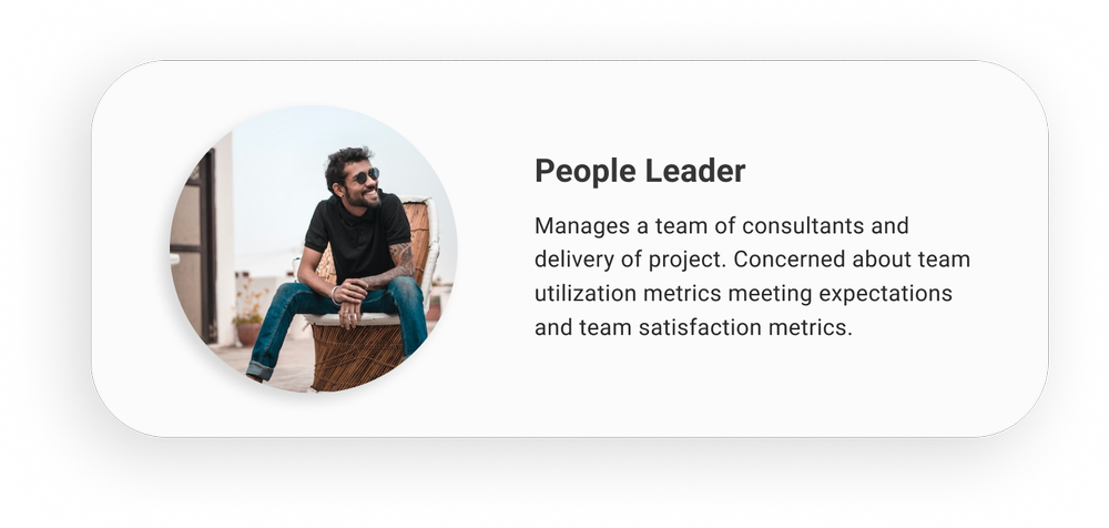
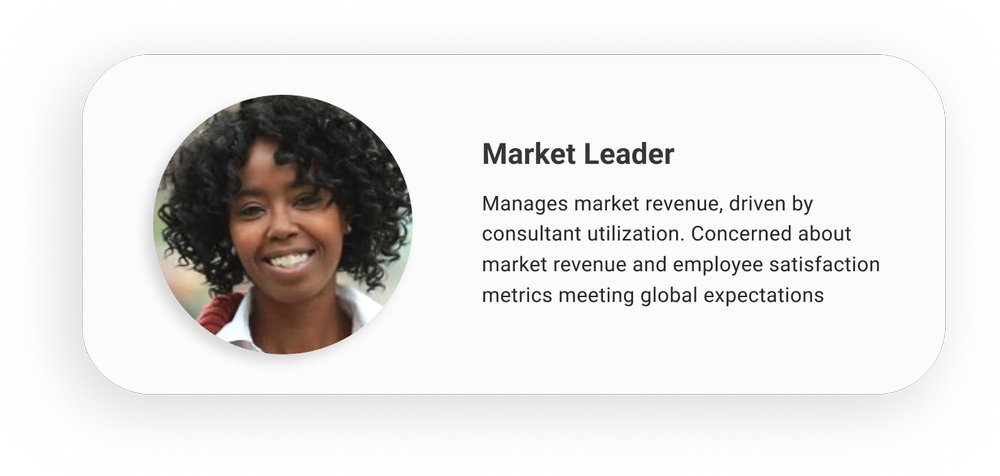
The research also showed that employees needed different levels of context depending on their role, which gave me three archetypes. Consultants needed to understand their work, growth and next opportunity, people leaders needed a clear view of their team without chasing updates, and market leaders needed to understand performance across a larger part of the business. I used these three views to decide what information each experience should surface first.
03Develop
Mapping the current and future state user flows.
I mapped the current state flows across the dashboard, profile, roles, staffing, learning and performance tools, and even simple questions meant moving between disconnected areas of the platform. I mapped the future state separately so the redesign wouldn’t inherit the old navigation and its assumptions.
Current state
Future state
Card sorting shaped the future state information architecture around the way employees grouped their work. I tested the proposed flows, refined them with feedback and then moved into low fidelity wireframes. The future state brought related work together, with performance beside career growth, role approvals beside staffing opportunities, and learning beside the skills employees were building.
03Develop
Building on the system that was already there.
me@slalom was built on Salesforce and the Salesforce Lightning Design System. I reused existing patterns wherever they fit and extended the system only where the employee experience needed something more specific, which kept the platform aligned with Salesforce while supporting light, dark and high-contrast themes. I reviewed the work weekly with product owners and Salesforce solution architects, and resolved product, platform and delivery constraints while the design was still flexible.
04Deliver
Designing, shipping and learning from real usage.
Once the structure was validated, I created high fidelity prototypes for the core experiences and designed the dark and high-contrast themes in from the start. Each feature was instrumented as it shipped, which gave the team a way to learn from real usage and improve the product over time.
One connected platform for career growth.
The six core experiences below turn the research findings into tools employees use in their day-to-day work.
Understanding performance and what comes next.
My Insights brings utilization, contribution ratio and experience index into one view. Employees can see how they’re tracking against their targets and compare their current role with the expectations of the next level.
Following a role from submission to approval.
My Roles makes role status visible. Employees can see priority roles, approval progress, the full role library and saved staffing opportunities without checking separate systems or asking for updates.
Finding staffing opportunities that fit.
Staffing Opportunities lets employees filter open roles by role and mastery level. Each opportunity expands in place, so people can read the client outcome, dates, hours and stage without losing the list.
I used the existing Salesforce filter patterns and designed the role list as expandable cards instead of a data table, because the decision needed more context than a fixed row could show.
Discovering learning that’s relevant now.
My Learning separates suggested learning, saved courses and required training. Required items are ordered by due date, and employees can resume where they left off.
Giving people leaders a clearer view of their teams.
The people leader dashboard keeps the whole team visible while a leader looks at one person’s utilization across three periods, their target gap, trend and recommended next actions.
Finding colleagues by capability as well as by name.
My Profile brings together experience, technologies, languages, certifications and reporting relationships, which makes it easier to find people with the skills a project or opportunity needs. The same profile works on mobile, with a compact contact card and horizontally scrolling tabs that keep the active section visible.
One platform for the work around a career.
A connected view of career growth.
Employees can understand their performance, explore roles and opportunities, find learning and see the people around them without moving between separate internal sites.
Accessibility designed in from the start.
Light, dark and high-contrast themes were designed alongside the core experience, all built on the Salesforce Lightning Design System.
A foundation for future internal products.
I extended the existing system instead of creating a parallel one, and the components added for me@slalom became reusable building blocks for future Slalom platforms. Feature instrumentation also created a feedback loop for future decisions.