

From paper to platform.
Whole Foods Market ran its company-wide employee policy on paper, with no digital source of truth. I designed Smart GIG, the platform that replaced it, with 8 features across authoring and viewing. It reaches more than 20,000 Team Members every week and reduced an estimated $1 million in annual legal risk.

Managing employee policy on paper.
Whole Foods managed its company-wide employee policy, the General Information Guide, through mostly paper-based workflows, with no digital source of truth for authors or for the legal team.
More than 20,000 Team Members looked up corporate policy every week, but the guide was a flat list of links that could not be sorted or searched. There was also no way to confirm that a Team Member had seen the current version of a policy, which exposed the company to significant legal risk.


My goal was to make Whole Foods employee policy easy to find for busy Team Members, while giving the legal team one place to track which Team Members had acknowledged each policy.
Built for policy authors and every Team Member.
I sorted findings from the stakeholder workshops into authoring and viewing pain points and scoped the features against them: one row for the authors writing policy, and one for the Team Members reading it.
-
Authoring
Centralized Digital Policy Management
Authoring, tracking and distribution are consolidated into one platform, with edit locking so authors can work on the same policy set without overwriting each other.
-
Authoring
Acknowledgement Tracking System
Team Member acknowledgements are requested and logged through automated tracking, notifications, and compliance escalation.
-
Authoring
Regional Policy Publishing
Region-specific policy elements are specified without creating a separate General Information Guide.
-
Authoring
Document Version Control
Every policy carries a status and a version number, and new versions are added from the editor so each change is tracked.
-
Viewing
Centralized Policy Access
All policies are held in one digital repository that every Team Member can reach.
-
Viewing
Current Version Search
Team Members can search the repository and always view the latest policy version.
-
Viewing
Smart Acknowledgement System
Specific policy changes are reviewed and acknowledged without re-acknowledging the entire document.
-
Viewing
Enhanced Experience Across Devices
The viewing interface is optimized for both desktop and mobile.
From whiteboard to build-ready.
I ran in-person workshops with the Whole Foods legal team and a sample of Team Members to map how policy moved through the paper General Information Guide. Weekly design reviews then carried my future state through wireframes, prototypes and a build‑ready specification.
01Discover
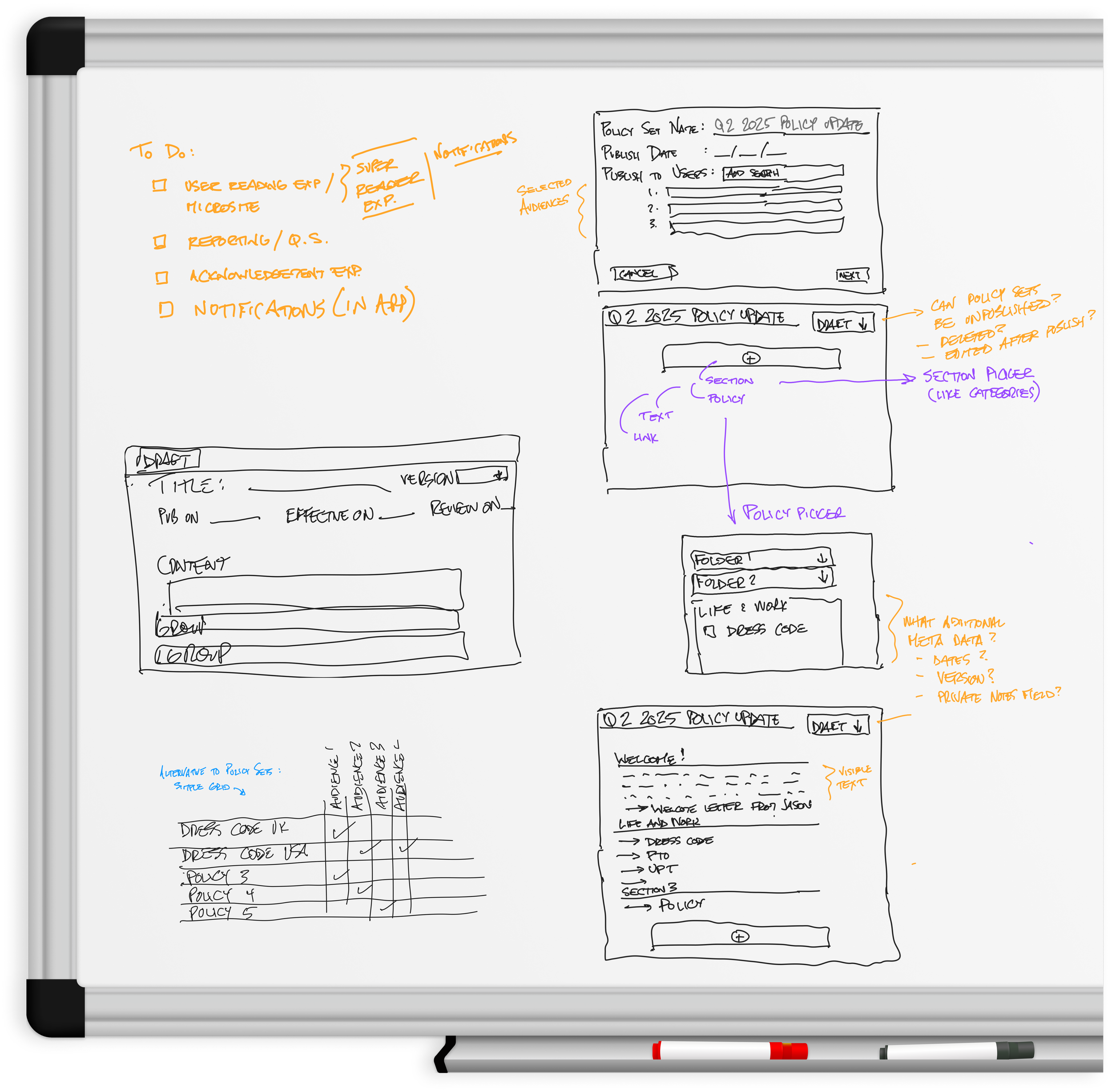
Running whiteboarding workshops with policy stakeholders.
I conducted in-person whiteboarding workshops with the Whole Foods legal team and a sample of Team Members. The sessions mapped how corporate policy was written, approved and distributed under the paper process. We grouped the open questions from each session by theme on the board.
02Define
Mapping the future state user flows.
I mapped future state user flows for both the authoring and viewing experiences. I defined policy sets, categories and the relationships between them before designing any screens.
Both flows draw on a single source of truth that serves two audiences: the authors writing policy and the more than 20,000 Team Members reading it.


03Develop
Moving the authoring screen through four fidelity passes.
I designed the authoring screen in four passes: marker sketches, low fidelity wireframes, an interactive prototype and a high fidelity specification. Each pass resolved one layer of decisions before the next pass started.

Defining what a policy set contains
I drew sketches live during the workshops with the legal team, at a few minutes per idea. They settled what a policy set contains and which sections each policy needs.
Testing how authors find and file policies
I used gray boxes and placeholder titles to test how an author finds a policy and attaches it to a category. I held back visual design until the flow was confirmed.
Validating the layout with authors
I laid out navigation, policy parameters and the editor and linked them into a clickable prototype. I tested the layout against author workflows in the weekly review sessions and refined it until it stopped changing.
Specifying every field and state
I drew every field, state and control at production fidelity, including statuses, version pickers, active and review date ranges and repeatable section blocks. The structure was already validated, so this pass focused on content and component states.
03Develop
Running weekly design reviews with authors and developers.
I ran weekly review sessions in person with end users, project managers and developers. We reviewed the low fidelity wireframes screen by screen, and I incorporated the feedback from each session before the next one.
Early feedback from policy authors shaped four screens: the policy library, the manage policies table, the create policy form and the dual-pane editor. Developers attended every session, so each design decision was checked against platform constraints as it was made.


04Deliver
Testing prototypes and handing off to development.
I tested high fidelity prototypes with Team Members and the legal team before development began. I continued visual design through launch, and eight features shipped across the authoring and viewing experiences.
I handed the specification to development as a complete user flow, with every screen state and transition drawn in sequence. Smart GIG now serves more than 20,000 Team Members every week.

Drag to follow the flow, click to zoom.
A single source of truth.
Smart GIG replaced the paper General Information Guide with one platform for writing policy and one for reading it. Authors build policy sets, target them by audience and location, and manage status and versions from a single table. Team Members search the guide, read the current version of a policy and acknowledge what changed on the same page.
Writing, targeting and versioning policy
-
Centralized Digital Policy ManagementManaging every policy from one tableAll policies and folders are listed in one table, with status, last edited, published, effective and review dates and version on every row. The table is searched by title, sorted and filtered by column, and rows are selected for bulk actions. Authors asked in the weekly reviews to see the status of every policy in one view. -
Centralized Digital Policy ManagementCreating a policy setA new policy set is started from the Smart GIG navigation and opens in its empty state. Content is added and held as an unsaved draft until it is saved, and the preview shows the set as Team Members will see it before anything is published. -
Regional Policy PublishingGrouping sections and choosing an audienceA group is added to a policy set from the section picker and given an optional title, with its sub-sections collapsed in the Content tab. Audiences are then searched and assigned to the group in the Audiences tab, so one set carries content for different groups of Team Members. -
Regional Policy PublishingTargeting a policy set to a locationThe target location is set from the publishing fields at the foot of the policy set, and a tooltip explains what targeting does. Region-specific policy is published this way without creating a separate General Information Guide for each region. -
Centralized Digital Policy ManagementWriting a policy with a live previewCreate policy opens the editor drawer, where the title, status, dates and content are filled in. The preview slides out beside the editor, so the author sees the policy as Team Members will while it is being written. I added the dual-pane layout after a weekly design review, and closing with unsaved edits raises a confirmation. -
Centralized Digital Policy ManagementEditing a policy another author may have openEdit opens the Edit Policy drawer over the Manage Policies table. A policy that another author is editing is shown as locked and unlocks when it is free, so two authors cannot overwrite each other's changes. -
Document Version ControlChanging a policy's statusA new status is chosen from the Policy Status dropdown and held as an unsaved edit. Where a saved policy with the same status already exists, a warning is shown before the change is saved. -
Document Version ControlAdding a new versionA new version is added from the Version Number dropdown. Any unsaved edits have to be resolved before the new version opens, so no change is carried between versions by accident. -
Centralized Digital Policy ManagementWorking with section blocksEvery editor control carries a tooltip: collapse all, expand all, rename, delete, style, alignment, move up and move down. Sections are collapsed and expanded in one action and reordered in place, which is what replaced the single free-text field in the early wireframes.
Finding, reading and acknowledging policy
-
Centralized Policy AccessReading the General Information GuideSmart GIG is opened from the Innerview navigation onto the guide's table of contents. A policy set is expanded and a policy opens on its own page. A single policy or the full guide is downloaded as a PDF, and earlier downloads are listed in one place. -
Current Version SearchSearching for a policyA policy is searched for directly from Innerview, and the result opens on its policy page inside the guide in its current version. The paper guide was a flat list of links with no search at all. -
Smart Acknowledgement SystemAcknowledging a policy updateA notification on Innerview home tells the Team Member that the policy set has been updated. The acknowledgement panel lists what changed, and the acknowledgement is submitted with a checkbox and confirmed on screen. Only the changes are reviewed, not the whole guide, and the submission is the record the legal team needed. -
Smart Acknowledgement SystemThe acknowledgement drawerAdmins are notified of an update from Innerview home in the same way. The acknowledgement drawer sits collapsed at the foot of the guide and expands to list the updates before the acknowledgement is submitted. -
Enhanced Experience Across DevicesThe guide on a phoneThe same viewing flow runs on a phone. The table of contents is browsed, a policy is opened and read, and the policy set is downloaded as a PDF. -
Enhanced Experience Across DevicesAcknowledging on a phoneOn a phone, the acknowledgement drawer sits collapsed at the bottom of the screen. It expands to show the updates, and the acknowledgement is submitted from the same drawer. -
Regional Policy PublishingSwitching between policy setsAdmins who manage more than one policy set switch between them from the dropdown under the search. The guide reloads for the selected set, and My GIG returns to their own.
The impact, by the numbers.
Estimated annual legal risk reduced by digitizing paper-based policy workflows.
Team Members served, accessing policies each week.
Digital source of truth, replacing manual paper workflows.
Features shipped across the authoring and viewing experiences.